Understanding Color Theory
The Basics of Color
Color theory is a set of principles used to understand how colors interact, affect emotions, and influence perceptions. The color wheel is a fundamental tool in color theory, divided into primary, secondary, and tertiary colors.
- Primary Colors: Red, blue, and yellow are the primary colors from which all other colors are derived.
- Secondary Colors: The secondary colors are created by mixing primary colors: green (blue and yellow), orange (red and yellow), and purple (red and blue).
- Tertiary Colors: These are formed by mixing a primary color with a secondary color, resulting in hues like red-orange or blue-green.
Color Harmony
Color harmony is achieved when colors are combined in a manner that is visually appealing. There are several common color schemes that can guide your choices:
- Monochromatic: This approach involves using different shades, tints, and tones of a single color. It creates a cohesive and serene look.
- Analogous: This scheme uses colors that are adjacent to each other on the color wheel, creating a harmonious effect. For example, blue, blue-green, and green work well together.
- Complementary: Complementary colors are directly opposite each other on the color wheel, such as blue and orange. This scheme creates a bold contrast.
- Triadic: This involves using three colors that are evenly spaced around the color wheel, such as red, blue, and yellow. It provides a vibrant and energetic feel.
The Psychology of Color
Colors evoke emotions and responses. Understanding the psychological effects of different colors can help you choose appropriate hues for each room:
- Red: Associated with excitement, passion, and energy. It is often used in dining areas to stimulate appetite.
- Blue: Conveys calmness, serenity, and trust. It works well in bedrooms and bathrooms for a peaceful atmosphere.
- Yellow: Symbolizes happiness and optimism. It is a great choice for kitchens or playrooms to create an energetic vibe.
- Green: Represents nature, balance, and growth. It is refreshing and can be used in living rooms or offices.
- Purple: Associated with luxury and creativity. It can add drama to a room and works well in creative spaces.
- Neutral Colors: Whites, beiges, and grays provide a calm backdrop and are versatile for any room.
Factors to Consider When Choosing Paint Colors
1. Room Function
The function of a room should heavily influence your color choice. Consider what activities will take place in each space:
- Living Room: Consider colors that promote relaxation and conversation, such as warm neutrals or calm blues.
- Bedroom: Opt for soothing colors like soft blues or greens to create a restful environment.
- Kitchen: Bright and cheerful colors like yellow or orange can inspire energy and creativity.
- Home Office: Choose colors that enhance focus and productivity, such as greens and grays.
2. Lighting Conditions
Lighting plays a crucial role in how paint colors appear in your home. Different lighting can change the perception of color:
- Natural Light: Rooms with abundant natural light will showcase colors more accurately, while darker rooms may require lighter colors to brighten the space.
- Artificial Light: Consider the type of light bulbs used. Warm white bulbs will create a softer glow, while cool white bulbs can enhance blues and greens.
3. Size of the Room
Color can influence the perceived size of a room. To make a small room feel larger, consider the following techniques:
- Light Colors: Light colors like whites, soft grays, and pastel shades can make a space feel more open and airy.
- Dark Colors: Dark colors can make a large room feel cozier, but if overused in a small room, they may make it feel cramped.
- Accent Walls: Create the illusion of space by painting one wall a darker color while keeping the other walls light.
4. Existing Furnishings and Decor
Take into account the colors of your existing furniture, decor, and fixtures when selecting paint colors:
- Color Coordination: Choose colors that complement your furniture and decor. If you have colorful pieces, consider neutral wall colors to let them stand out.
- Material Textures: Different materials reflect light differently—matte finishes absorb light, while shiny surfaces reflect it. Choose paint finishes that work well with existing textures.
Room-by-Room Guidelines
Now that we've established foundational elements for choosing paint colors, let's explore specific guidelines for selecting the perfect colors for each room in the house.
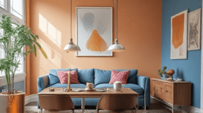
Living Room
The living room is often the heart of the home, making it essential to create a welcoming and comfortable atmosphere:
- Color Recommendations: Warm neutrals like beige, taupe, and soft grays create a cozy environment. For a bolder look, consider muted blues or greens.
- Accent Colors: You can use accent walls or colorful artworks to introduce pops of color. Consider warmer tones for a more inviting feel.
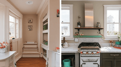
Kitchen
The kitchen is a space for creativity and nourishment, so vibrant colors can enhance its ambiance:
- Color Recommendations: Soft whites, pale yellows, and light blues can create a fresh and airy feel. Bright colors like coral or teal can add a playful touch.
- Backsplash and Cabinets: Consider the colors of your cabinets and backsplashes. Keep them consistent with your wall colors for a cohesive look.
Bedroom
Creating a serene and restful environment in the bedroom is key to a good night's sleep:
- Color Recommendations: Soft blues, greens, and lavenders promote relaxation. Neutral colors can also be peaceful when paired with soft linens and textures.
- Accent Walls: If desired, you can create an accent wall behind the headboard using a deeper shade to add depth without overwhelming the space.
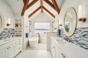
Bathroom
Bathrooms should be a retreat for relaxation, so consider colors that evoke tranquility:
- Color Recommendations: Crisp whites, soft blues, and gentle greens create a spa-like atmosphere. Earthy tones like taupe can also provide warmth.
- Light Reflection: Use light colors to enhance the sense of space in smaller bathrooms while darker shades can add drama in larger ones.
Home Office
Your home office should inspire productivity while ensuring comfort:
- Color Recommendations: Soft greens and blues promote focus and calm. Light neutrals can create a classic backdrop for artwork and shelves.
- Personal Touch: Incorporate personal colors that energize and motivate you, whether through paint or decor.
Dining Room
The dining room is a space for gathering and celebration, so a welcoming atmosphere is essential:
- Color Recommendations: Warm colors like terracotta, classic beige, or muted reds can stimulate appetite and conversation.
- Ambiance: Consider pairing these colors with warm lighting to enhance the cozy feel.
Hallways and Entryways
The hallways and entryways set the stage for the rest of the home, so consider colors that create a smooth transition:
- Color Recommendations: Soft neutrals or light shades can brighten the transitional spaces and make them feel larger.
- Accent Features: Adding a bold color on one wall can create a focal point without overwhelming the area.
Tips for Testing Paint Colors
Once you’ve narrowed down your color choices, it’s essential to test them before making a final decision:
1. Use Paint Samples
Purchase small paint samples or swatches to test out colors in the actual space. Color can look different in various lighting conditions.
2. Consider Size
Paint a larger area on the wall to see how it appears. A small patch may not accurately represent the coverage and effect of the color.
3. Observe Throughout the Day
Colors can change throughout the day as light conditions shift. Observe your chosen samples during different times of the day to see how they interact with the space.
4. Combine with Decor
Before committing to a color, envision how it will look with your furniture, textiles, and decor. Take fabric swatches or decor samples to compare against the paint colors.
Conclusion
Choosing the perfect paint colors for your home is an exciting opportunity to express your personal style and transform your living spaces. By understanding color theory, considering the function and mood of each room, and testing your color choices, you can make informed decisions that enhance your home’s aesthetic.
Remember to embrace the versatility of paint—it is a powerful tool that can create warmth, depth, and character. Whether you opt for calming neutrals or bold, statement colors, the right paint can truly elevate your home. With these guidelines in mind, you are well-equipped to embark on your painting journey and create beautiful, inspiring spaces that reflect your personality.